Abstract
Tableau is widely used to build effective visualization, which are based on large datasets and in the process assist users in finding deeper insight in the associated data. This report explains how a given dataset is manipulated, augmented and consumed by Tableau. Five questions, as anticipated in a top management meeting scenario, are asked about the dataset. To answer the five questions a rationale is given for the design decisions that underly four visualizations. The four visualizations are used to build a final dashboard, which is presented to the stakeholders of the scenario. Overarching tasks are utilized that assists the presenter to effectively interact with the dashboard to convey a storyline to the stakeholders regarding the data.
Introduction
This report describes the creation of a visualization dashboard as planned out in . The dashboard consists of four primary visualizations, which provide answers to five individual questions. The five questions shape the underlying narrative of a scenario that takes place in a company’s weekly upper managerial meeting. Such a meeting is attended by various stakeholders that are most likely to generate the five questions in hand. The scenario is underpinned by four individual tasks which overlays and binds the four individual visualizations together.
This report begins by describing the data that drives the four visualizations in the dashboard as well as additional data sourced from Wikipedia that augments the original dataset. The Methods section provides a detail description of the approach that was followed in designing the four visualizations. Each of the five questions is addressed separately along side the design choices that went into realizing each of the four visualizations.
The final dashboard is then overviewed in the Results and Discussion section where the dashboard’s instructiveness and overlaid information is discussed.
Finally, a conclusion is drawn which casts light on a hidden aspect discovered about the underlying dataset and why the dashboard succeeded in finding this aspect.
Data
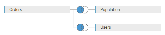
The four visualizations are based on the data as received in . The data file holds order information for a store that sells goods. The data file contains four datasets; Orders, Returns, Users and Regions. The data in the Return dataset has been omitted because, the correlation between Orders and Returns has proven to be insufficient. The Region dataset is empty and has therefore also been omitted. Initial data exploration and evaluation proved to be frustrating in terms of depth of complexity and therefore, it was opted to include population numbers of each state, as specified in the 2010 USA census , to the data set. To amalgamate the three contributing datasets a left-outer-join between the Orders, Users and USA census data was executed in Tableau. This produced the final data set on which the dashboard was built.
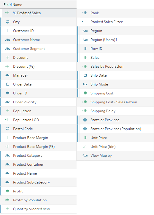
The final dataset resulted in 39 fields (including newly derived/calculated fields);
16 categorical (nominal), 7 categorical (ordinal) and 16 quantitative fields.
Appendix A lists the layout of the left-outer-join structure as well as a table, which lists a partial view of the fields in the final dataset. The derived and calculated data fields in the data set will be listed and described as part of each of the four individual visualizations as described in the Methods section.
Methods
Careful consideration was taken when decided which encoding methods should be used to most effectively and accurately convey insight into the underlying data set. This was a very important exercise as it determined how effectively the four visualizations could answer the five questions asked. This section lists each of the five questions along with the visualization that was chosen to answer that question. An analysis of each visualization is then presented along with the chosen encoding methods that are utilized in the visualization.
Question 1
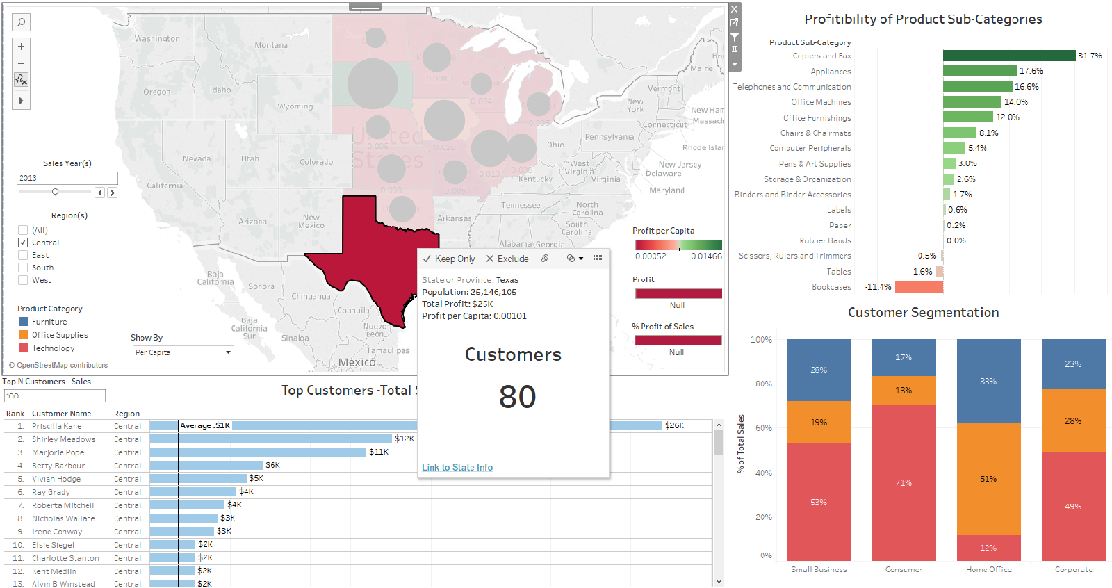
Stakeholder: CEO of the company – “Please present me a geographical overview of sales vs. profits, profit per capita and percentage profitability for the past four years and break the map down in terms of the four geographical regions the company covers and also report on population, customer and order numbers per state?”
Analysis
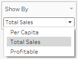
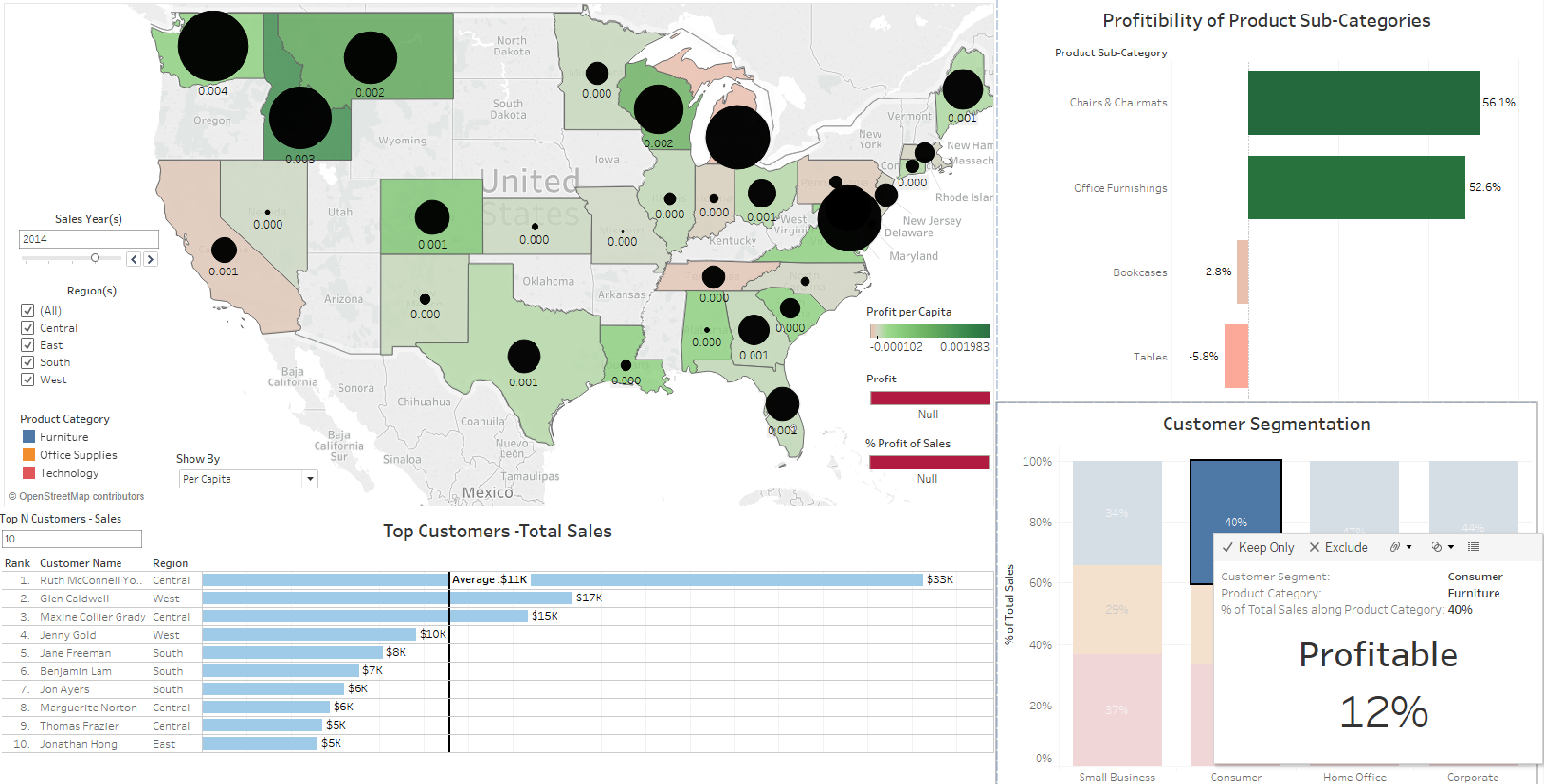
The first question is really three questions in one. The question calls for three different views over a geographical area – North America. To satisfy this requirement in the question, Tableau’s worksheet overlay capability must be exploited. This entails the creation of three different worksheet, which are focused on the same geographical area but, which emphasize different statistics regarding the underlying data set. In the main dashboard the user is equipped with a dropdown menu through which each of the three views can be called into focus (Figure 3). The three menu options are associated to the three worksheets in the following way:
-
Per Capita - Profit per Capita worksheet (Figure 4)
-
Total Sales - Sales vs. Profits worksheet (Figure 5)
-
Profitable – Percentage Profitability worksheet (Figure 6)
For all three the above listed visualizations the following visual encoding rules were utilized:
-
Identity Channels: Longitude, Latitude, Spatial region
-
Magnitude Channels: Area (2D), Color saturation (divergent). The contrast of the black circles and the red-green divergent color saturation scale works well together in the sense that the two magnitude channels do not clash.
-
Markers: Text, Tooltip (Breakdown of transportation cost per product category, Population total per state, Orders per state, Customers per state, URL link to the selected state’s wiki page)
To satisfy the temporal and regional selection requirement in question 1, an overlaying couple of filters were implemented:
-
Timeframe filter – This filter enables the user to step through the timeframe 2012 – 2015. The user can also opt to select an amalgamated total view of statistics for all the years combined.
-
Region filter – This filter enables the user to view the statistics of each of the four regions separately or all together.
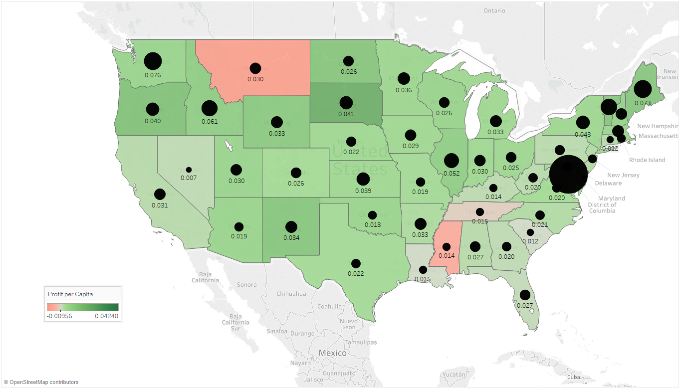
Per Capita worksheet - This worksheet illustrates the two per capita statistics of each state. The black circle on each state illustrates the sales per capita quantity and the color saturation illustrates the profit per capita. These statistics are implemented by the following calculated fields:
Sales per Population = ∑ (Sales) / ∑ (Population LOD) and
Profit per Population = ∑ (Profit) / ∑ (Population LOD)
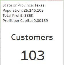
For Tableau to summate population numbers per state, the LOD (Level of Detail) functionality of Tableau must be utilized . By hovering the mouse pointer over each state an additional statistic is displayed – number of customers and the population (Figure 7). This satisfies the “population and customer numbers” portion of question 1.
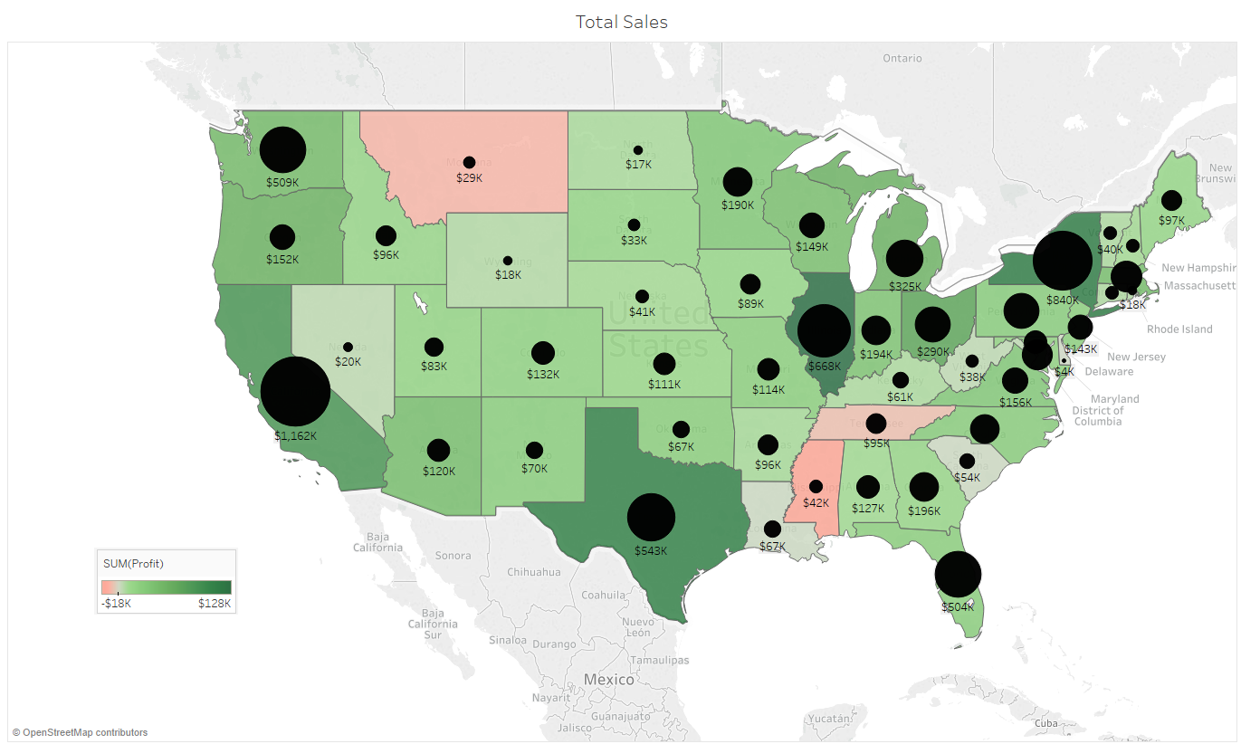
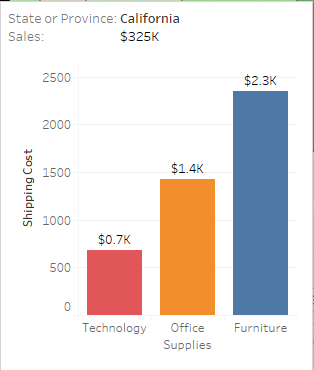
Total Sales worksheet - This worksheet describes the total sales and total profits per state. The black circle on each state illustrates the total sales and the color saturation of each state illustrates the total profit. These statistics are the verbatim numbers as reported in the main data set. By hovering the mouse pointer over each state an additional statistic is display – shipping cost as broken down per product category (Figure 8). This exploration is key in verifying an underlying issue discovered in the dataset.
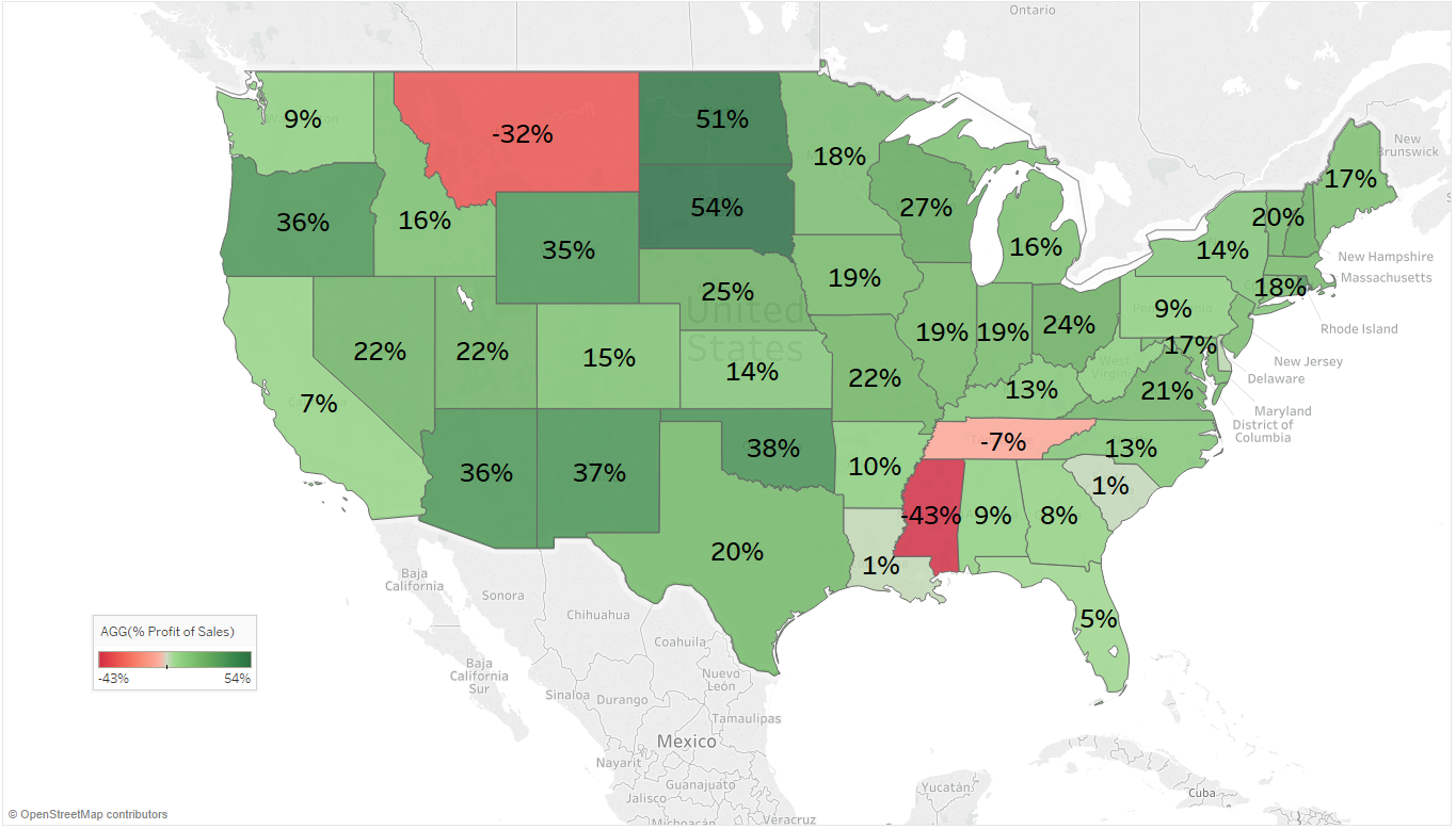
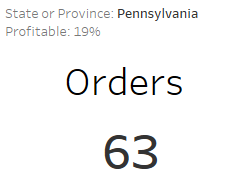
Percentage profitability worksheet - This worksheet reports the profit of each state as a percentage of the total sales for each state. This statistic is implemented by the following calculated field:
% Profitability = [∑ (Profit) / ∑ (Sales)] x 100
By hovering the mouse pointer over a state, an additional statistic is displayed for the state – number of orders (Figure 9). This satisfies the “number of orders” portion of question 1.
By combining three worksheets in an overlaid fashion the initial canvas portion allocated to the dashboard can by tripled. If the user selects any of the states on the map, the dashboard isolates the selected state by highlighting it, dimming the rest of the map, displaying a tooltip associated with the selected state and presents a url link at the bottom of the tooltip. This url link is a link to the selected state’s wiki page. This might come in helpful if management needs broader general information regarding a state that is being discussed.
Question 2
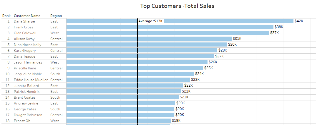
Stakeholder: Regional Managers – “We’d like to find out who our top customers are for each region and each state?”
Analysis
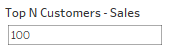
As this question requests a ranking order, it was deemed appropriate to choose a horizontal bar chart to express this order (Figure 11). By ranking the customers in a descending order by total sales, it utilizes the attentive characteristics of the chart and assist the users to quickly and easily identify the top customers. A text marker is placed next to each horizontal bar so that the user can see the precise figure associated with the ranked customer. Three additional text markings are displayed with each of the horizontal bars - Rank, Customer Name and Region. The user can specify the number of customers to be viewed by typing a number into the Top N Customer – Sales entry box, which is situated at the top left-hand corner of this worksheet. The entry dialog box was implemented by a Tableau parameter – Integer with range 1 to N, a True/False filter and a calculated field that calls the RANK Tableau function for all Sales in the following manner: RANK(∑ ([Sales]))
By combining the number of customers specified in the Top N Customer – Sales entry box and the region filter, the user can easily and quickly view the top customers per region or in general. The following encoding rules were utilized for this visualization:
-
Identity Channels: Y-Axis Labelled, Text
-
Magnitude Channels: Position on common scale
-
Markers: Text
Finally, a line is displayed vertically across the horizontal bars. This line pre-attentively indicates the average total sales of the selected N customers and it establishes an intuitive relation among the selected N customers.
Question 3
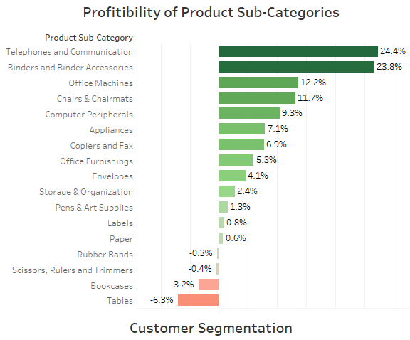
Stakeholder: Company Accountant – “I’d like to see a profit and loss breakdown over product sub-categories as well as the total sales for each of the product subcategories?”
Analysis
Profits and losses, by nature, ranges from negative to positive, i.e. a “loss” is a negative number and a “profit” is a positive number. For that reason, an ordered butterfly bar chart was chosen (Figure 13). The visualization orders the product sub-categories from most profitable to least profitable. The horizontal nature of the chart also enables the categories listed down the Y-Axis to be easily readable. The following encoding rules were utilized for this visualization:
-
Identity Channels: Y-Axis – Spatial region, Text
-
Magnitude Channels: X-Axis – Position on common scale, Color saturation (divergent)
-
Markers: Text, Tooltip
A very strong cohesion is encoded onto the magnitude channel by super imposing color saturation onto the position of the common scale and then additionally augmenting it by the percentage profit text marks on each bar.
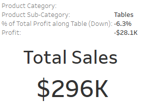
By hovering the mouse pointer over each bar, a tooltip is displayed that reports and additional statistic – total sales for the associated product sub-category (Figure 12). This satisfies the latter part of question 3.
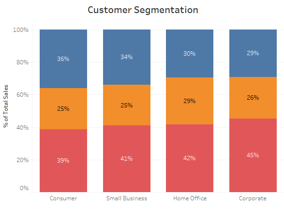
Question 4
Stakeholder: Marketing Manager –” I’d like you to query the dataset and display a breakdown of customer segment spending over the main three product categories for each region and express the ratios as part of the whole. Then, for each of these segments I’d also like to know what the percentage profitability is?”
Analysis
Seeing that there are only three product categories – Furniture, Office Supplies and Technology, the pie chart surfaces as a likely candidate. Pie charts are, by default, good at displaying 2 – 5 parts of a whole. But, the latter part of the question warrants the pie chart unfavorable as the visualization also needs to take customer segmentation into consideration. Therefore, it was opted to use a stacked bar chart instead (Figure 14). However, to compare the percentage of sales per customer segment over the three product categories, the stacked bar chart visualization was expressed as a percentage of the whole, i.e. as parts of 100% of the total sales per segment. The following encoding rules were utilized for this visualization:
-
Identity Channels: X – Axis, Color Hue.
-
Magnitude Channels: Y-Axis (Position on a common scale)
-
Markers: Text, Tooltip
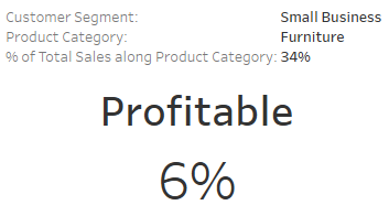
This visualization effectively compares percentage of total sales volume across customer segments and therefore satisfies the first part of the question. By hovering the mouse pointer over each of the customer segments a tooltip displays an additional statistic – percentage profitability of the customer segment (Figure 15). This satisfies the latter part of the question.
Question 5
Stakeholder: CEO of the Company– “Can you identify any areas in the business, which over the last 4 years, have effected profitability? And, why?”
This question can only be answered by evaluating the dashboard as a whole. Refer to the section labelled, Results and Discussion for the answer to this question.
For all encoding rules in Questions 1 – 4, refer to and .
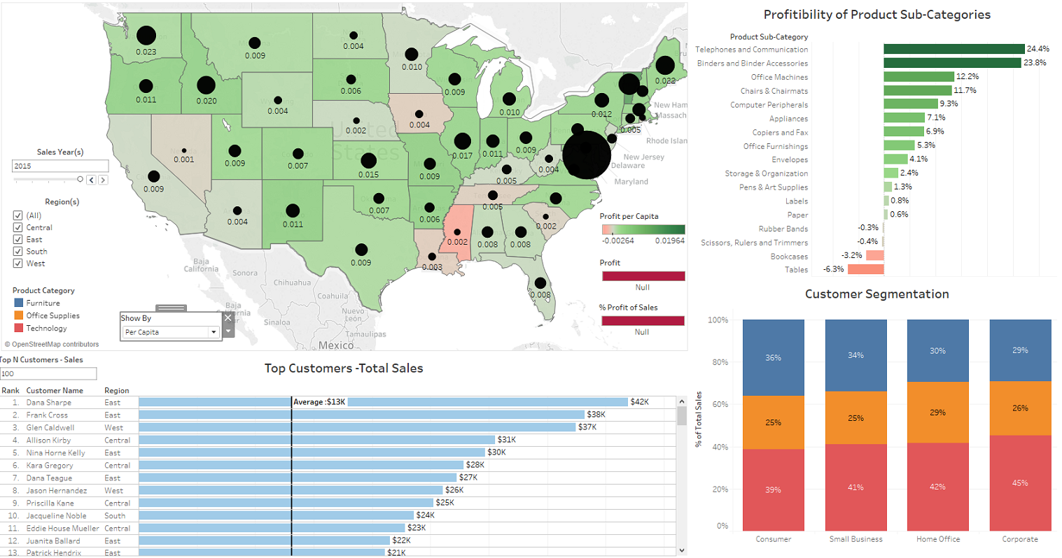
Interactivity
A dashboard in Tableau consists of several worksheets that are arranged on one work area (canvas). Tableau enables the worksheets to function in an interactive manner by ways of setting a filter option on each individual worksheet. The dashboard for this assessment as illustrated in Figure 16, has the filter option enabled on each of the four worksheets. This means that by selecting any of the elements (state, bar or segment in bar), will filter the underlying data set on the selected element. During a selection of one of the elements on a worksheet, the other three worksheets will filter accordingly. This enables the user to drill down on specific elements of the underlying data set and explore how different categories and elements relate to each other. Additional to the filter selection, the dashboard also incorporates the Region and Time filters as well as the Top N Customers selector. By combining the above filter and selection elements the dashboard presents a very strong explorative and interrogative tool as can be illustrated in . The following three figures illustrate various combination of filters, selectors and selections that can be combined:
-
Figure 16 – No filters and selectors set
-
Figure 17 – Time Filter = 2013, Region Filter = Central, State Selected = Texas, Top N Customers = 100
-
Figure 18 – Time Filter = 2014, Customer Segment = Consumer, Top N Customers = 10.
The four tasks (present, discover, query and identify), which assists the user in effectively portraying a storyline to the stakeholders in the given scenario, are bound and supported by the interactive capabilities of the dashboard.
Results and Discussion
All requirements and criteria asked for from the four questions are answered by the four visualizations. By utilizing part of the dashboard as an overlay section, more information can be presented in a limit physical canvas area. Enabling tooltips for each visualization and also adding additional statistical information to each tooltip enabled the user to satisfactory answer every aspect of the questions asked.
The answer to the 5th question is as follows. In Figure 16, from the worksheet labelled, Profitability of Product Sub-Category, one can easily identify that the products sub-category labelled, Tables, is incurring large losses for each year. Yet, from the worksheet labelled, Customer Segment it is easy to see that the Furniture product category (of which Tables is part) contribute to, on average, 33% of all sales across the four main customer segments. This means that a third of the company’s sales effort results in a substantial loss to the company. The reason for this becomes evident when the geographical map is explored. By invoking the tooltip on the Total Sales and Profit map, one can observe that for most of the states the shipping costs for Furniture are disproportionally high as compared to the shipping costs of Technology and Office Supplies. Therefore, a valid suggestion to top management would be to re-evaluate the Furniture section of the business. From the data it is observed that the Furniture category of the business is drawing a significant sales effort only to incur huge profit losses. Either, the company must abandon the Furniture category or, find a cheaper transportation solution for this product category.
Conclusion
By effectively utilizing the data wrangling capabilities of Tableau, one can manipulate large data sets very effectively. By combining the given data with external sources, such as , one can enhance the base dataset and draw further insight there from. Effective identity and magnitude channel pairing has led to a well correlated and cohesive answer set in the form of four visualizations, which answers the initial five questions in a sufficient manner. Tableau’s ability to bind separate worksheet together in one coherent dashboard gives the user the ability to effectively portray a story as well as gain deep insight into the underlying dataset.
Appendix A
A screenshot of a cell phone Description generated with very high confidence
Figure 1 – Dataset
A picture containing screenshot Description generated with high confidence
Figure 2- Left outer join of Order, Population and Users
Appendix B
A screenshot of a cell phone Description generated with very high confidence
Figure 3 - Worksheet selector for geographical area
A close up of a map Description generated with high confidence
Figure 4 - Profit per Capita
A close up of a map Description generated with high confidence
Figure 5 - Sales vs. Profits
A close up of a map Description generated with very high confidence
Figure 6 - Percentage Profitability
A close up of a sign Description generated with very high confidence
Figure 7 - Tooltip (Number of Customers)
A screenshot of a cell phone Description generated with high confidence
Figure 8 - Shipping Costs – Broken down per product category
A screenshot of a cell phone Description generated with high confidence
Figure 9 - Number of Orders
A screenshot of a cell phone Description generated with high confidence
Figure 10 - Select Top N Customers
A screenshot of a cell phone Description generated with high confidence
Figure 11 - Top N Customers
A screenshot of a cell phone Description generated with very high confidence
Figure 12 - Total Sales per Product Sub-Category
A screenshot of a cell phone Description generated with very high confidence
Figure 13 - Percentage profitability per Product Sub-Category
A screenshot of a cell phone Description generated with very high confidence
Figure 14 - Sales volume over Customer Segments
A screenshot of a cell phone Description generated with very high confidence
Figure 15 - Percentage Profitability for selected Customer Segment/Product Group
A close up of a map Description generated with very high confidence
Figure 16 – Dashboard
A screenshot of a map Description generated with very high confidence
Figure 17 - Dashboard - Filter I
A screenshot of a map Description generated with very high confidence
Figure 18 - Dashboard - Filter II